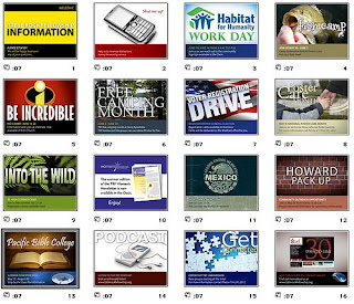
Here are some tips for an impressive Powerpoint Slides for your presentation :-
1. OUTLINE
• Make your 1st or 2nd slide an outline of your presentation
Ex: previous slide
• Follow the order of your outline for the rest of the presentation
• Only place main points on the outline slide
Ex: Use the titles of each slide as main points
Good
• Use 1-2 slides per minute of your presentation
• Write in point form, not complete sentences
• Include 4-5 points per slide
• Avoid wordiness: use key words and phrases only
• Show one point at a time:
Will help audience concentrate on what you are saying
Will prevent audience from reading ahead
Will help you keep your presentation focused
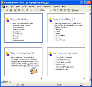
Bad
• Not too many words for a presentation slide. If it is not written in point form, it would be difficult for your audience to read and for you to present each point. Although there are exactly the same number of points on this slide as the previous slide, it looks much more complicated. In short, your audience will spend too much time trying to read this paragraph instead of listening to you.
• Do not use distracting animation
• Do not go overboard with the animation
• Be consistent with the animation that you use

3. FONTS
Fonts communicate subtle messages in and of themselves, which is why you should choose fonts deliberately. Use the same font set throughout your entire slide presentation, and use no more than two complementary fonts (e.g., Arial and Arial Bold).
Good
• Use at least an 18-point font
• Use different size fonts for main points and secondary points
• this font is 24-point, the main point font is 28-point, and the title font is 36-point
* A font size of 28 to 34 with a bold font is recommended for subtitles.
• Use a standard font like Times New Roman or Arial
Bad
• If you use a small font, your audience won’t be able to read what you have written
• CAPITALIZE ONLY WHEN NECESSARY. IT IS DIFFICULT TO READ
• Don’t use a complicated font
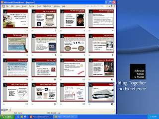
4. COLOUR
Color evokes feelings. Color is emotional. The right color can help persuade and motivate. Studies show that color usage can increase interest and improve learning comprehension and retention.
• Colors can be divided into two general categories: cool (such as blue and green) and warm (such as orange and red). Cool colors work best for backgrounds, as they appear to recede away from us into the background. Warm colors generally work best for objects in the foreground (such as text) because they appear to be coming at us. It is no surprise, then, that the most ubiquitous PowerPoint slide color scheme includes a blue background with yellow text. You do not need to feel compelled to use this color scheme, although you may choose to use a variation of those colors.
• If you will be presenting in a dark room (such as a large hall), a dark background (dark blue, gray, etc.) with white or light text will work fine. But if you plan to keep most of the lights on (which is highly advisable), a white background with black or dark text works much better. In rooms with a good deal of ambient light, a screen image with a dark background and light text tends to washout, but dark text on a light background will maintain its visual intensity a bit better.
Good
• Use a colour of font that contrasts sharply with the background
Ex: blue font on white background
• Use colour to reinforce the logic of your structure
Ex: light blue title and dark blue text
• Use colour to emphasize a point, But only use this occasionally
Bad
• Using a font colour that does not contrast with the background colour is hard to
read
• Using colour for decoration is distracting and annoying.
• Using a different colour for each point is unnecessary
• Using a different colour for secondary points is also unnecessary
• Trying to be creative can also be bad
Color Combinations to Avoid
Some colors should not be used together for a variety of reasons, so here are some combinations to avoid:
Red & Green – these two colors clash with each other and are very hard to read. Also, people who are red-green color blind will not be able to figure out what you are trying to say on the slide.
Orange & Blue – another pair that causes a disturbing effect on readers as the colors seem to vibrate against one another.
Red & Blue – these two colors just do not have enough contrast to be seen well when used together. This combination also seems to suffer a further loss of contrast when projected on a screen.
Best Color Combination Suggestions
Dark Background with Light Text and Graphics
Background – a dark blue (navy shade) or dark purple
Text and Graphics – white or yellow
Accent Colors – red, lime green, camel orange, light blue
The dark blue or dark purple background gives good emotional feelings as the predominant color on the screen and the yellow and white text and graphics have good contrast with the background. The accent colors should be used to highlight a word or portion of a graphic, not overused or they will become annoying.

5. BACKGROUND
Backgrounds should never distract from the presentation. Using the default white background is hard on the viewer’s eyes. You can easily add a design style or a color to the background. Backgrounds that are light colored with dark text, or vice versa, look good. A dark background with white font reduces glare. Colors appear lighter when projected. Pale colors often appear as white. Consistent backgrounds add to a professional appearance. For a long presentation, you may want to change background designs when shifting to a new topic.
Good
• Use backgrounds that are attractive but simple
• Use backgrounds which are light
• Use the same background consistently throughout your presentation
Bad
• Avoid backgrounds that are distracting or difficult to read from
• Always be consistent with the background that you use
6. GRAPHS
Good
• Use graphs rather than just charts and words
• Data in graphs is easier to comprehend & retain than is raw data
• Trends are easier to visualize in graph form
• Always title your graphs
Bad
• Minor gridlines are unnecessary
• Font is too small
• Colours are illogical
• Title is missing
• Shading is distracting
Always be asking yourself, "How much detail do I need?" Presenters are usually guilty of including too much data in their on-screen charts. There are several ways to display your data in graphic form; here are a few things to keep in mind:
Pie Charts. Used to show percentages. Limit the slices to 4-6 and contrast the most important slice either with color or by exploding the slice.
Vertical Bar Charts. Used to show changes in quantity over time. Best if you limit the bars to 4-8.
Horizontal Bar Charts. Used to compare quantities. For example, comparing sales figures among the four regions of the company.
Line Charts. Used to demonstrate trends. For example, here is a simple line chart showing that our sales have gone up every year. The trend is good. The arrow comes in later to underscore the point: Our future looks good!
In general, tables are good for side-by-side comparisons of quantitative data. However, tables can lack impact on a visceral level. If you want to show how your contributions are significantly higher than two other parties, for example, it would be best to show that in the form of a bar chart (below, right). If you're trying to downplay the fact that your contributions are lower than others, however, a table will display that information in a less dramatic or emotional way.
7. SPELLING AND GRAMMAR
• Proof your slides for:
speling mistakes
the use of of repeated words
grammatical errors you might have make
• If English is not your first language, please have someone else check your presentation!

8. CONCLUSION
• Use an effective and strong closing
• Your audience is likely to remember your last words
• Use a conclusion slide to:
Summarize the main points of your presentation
Suggest future avenues of research
9. QUESTIONS??
• End your presentation with a simple question slide to:
Invite your audience to ask questions
Provide a visual aid during question period
Avoid ending a presentation abruptly
SUMMARY
Keep the presentation simple
Avoid unnecessary sounds and animations
Keep information well organized
DO NOT read from your slides verbatim
Remind your audience of key points at the end of the presentation
Note : TO ALL MHM AND MHF STUDENTS :
All the best for your Master's Project (Proposal & Write Up) presentation next week!
(13th - 17th April, 2009).
From : DR. HONEY


3 comments:
I do agree with your tips on good power point slides presentation. Dr, may you share your knowledge on how to write in proper the "references" (for any assignment etc.
En. Azrul, please refer to this website :-
http://www.liu.edu/cwis/cwp/library/workshop/citapa.htm
Thanks Dr. I've surf that website & it is really helpful.
Post a Comment